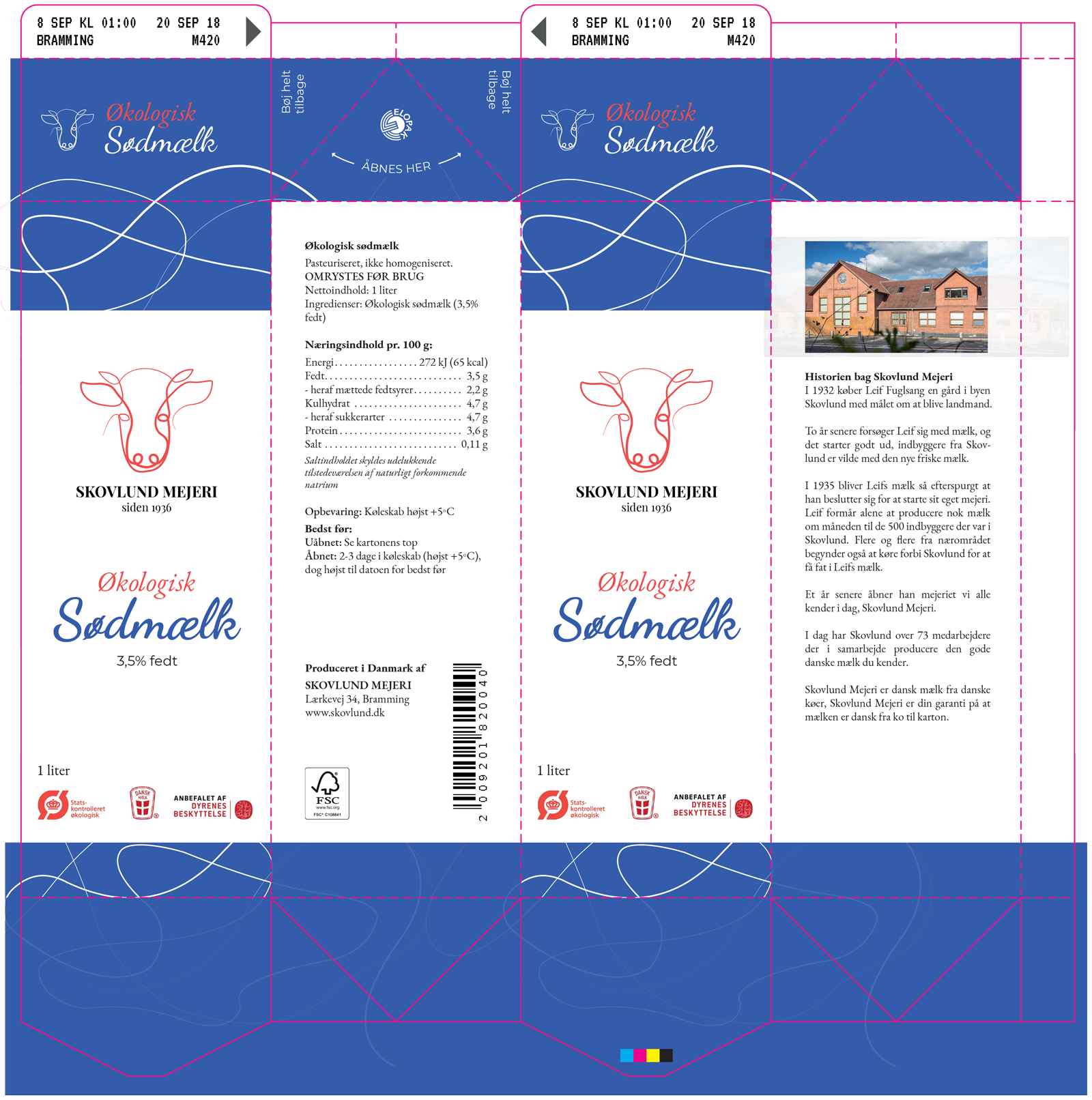
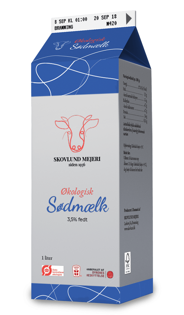
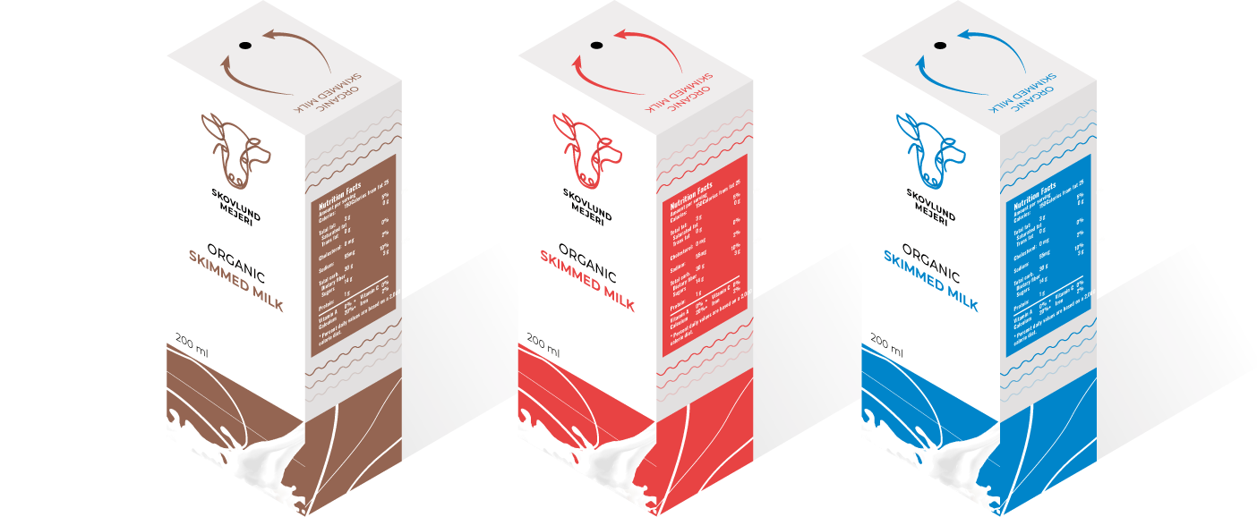
For this school project we were handed a task to create our own dairy brand. This included a visual identity, a real life printed mockup of a product, and a minute long brand video.
CLIENT: HANSENBERG
PROJECT: Create a dairy brand
ROLE: Art direction / lead Design
YEAR: 2018
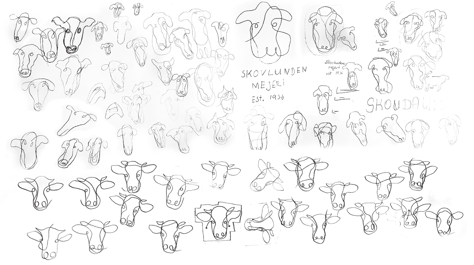
Usally I don't go with the first idea I get, but I had a gut feeling about this one. A cow, drawn in one line to symbolize that their products are danish from cow to final product. Trying to perfect the logo I ended up drawing 82 different cow sketches before I had one that I was happy with.
I wanted to tell a story with this logo, that this brand is danish all the way from cow to carton. Therefore the main color was clear to me. To represent the danish part in this company the main color of course had to be red.
To resemble the organic shape of the monogram itself I went with a lively script typeface called Dancing Script. I felt it cave the brand a friendly and spontaneous look.
To give some contrast I went the serif Garamond to give the design some straight lines
Garamond
AaBbCcDdEeFfGgHhIiJjKkLlMmNnOoPpQqRrSsTtUuVvWwXxYyZz
BoldAaBbCcDdEeFfGgHhIiJjKkLlMmNnOoPpQqRrSsTtUuVvWwXxYyZz
Dancing Script
AaBbCcDdEeFfGgHhIiJjKkLlMmNnOoPpQqRrSsTtUuVvWwXxYyZz
#EF4141
C: 0 M: 73 Y: 73 K: 6
#335CAA
C: 70 M: 46 Y: 0 K: 33
#000000
C: 0 M: 0 Y: 0 K: 100
#FFFFFF
C: 0 M: 0 Y: 0 K: 0
I continued with the organic theme throughout the whole design. Since the final carton of milk ended up being a organic milk, i felt this fit perfectly.