Morningcatch is a free popup tool, which can be used by any company or individual. It's been developed by a danish digital bureau called Morningtrain Technologies.

CLIENT: Morningtrain

PROJECT: Redesign of website

ROLE: Art direction / lead Design

YEAR: 2022

See demo
01
The workflow

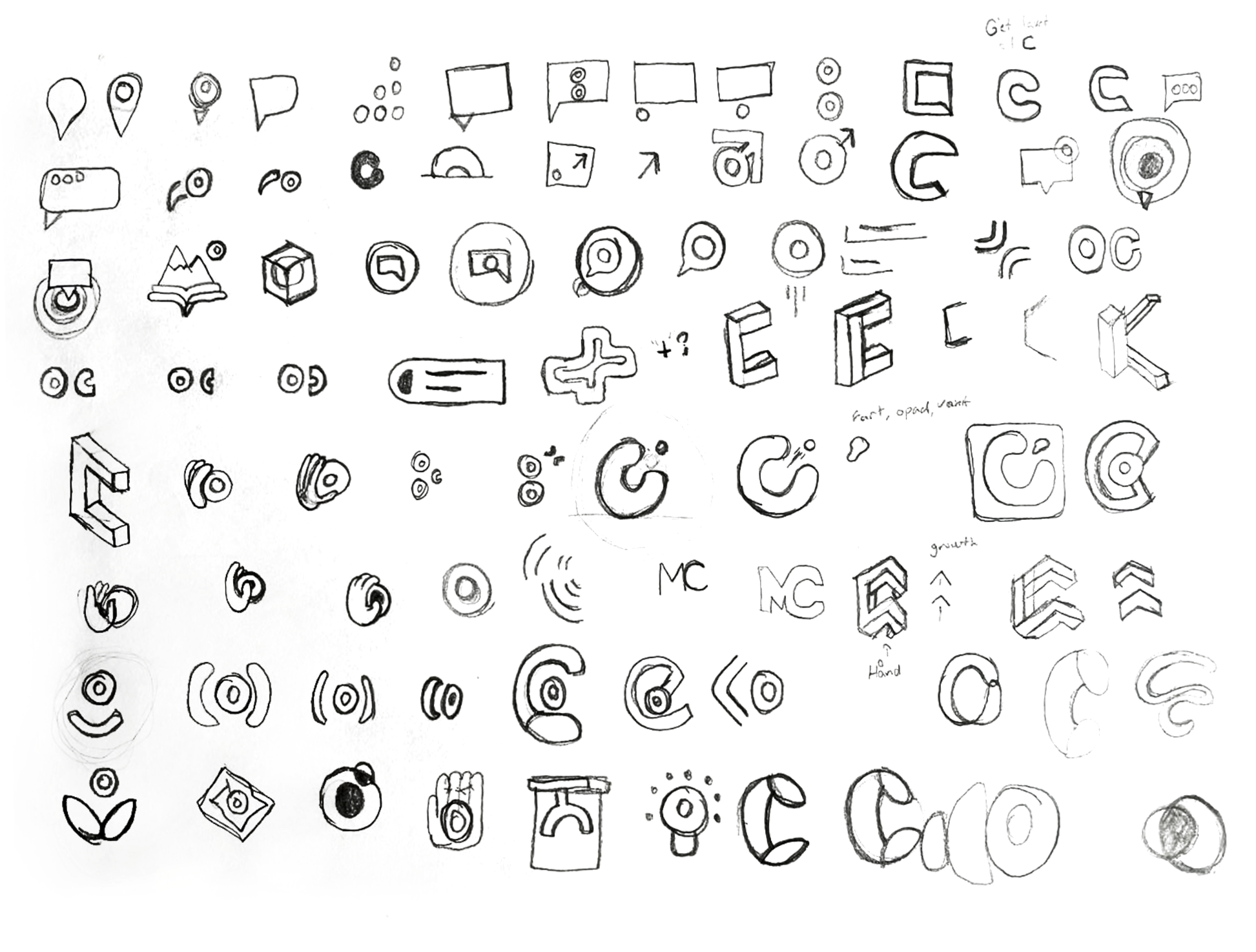
For this rebrand I wanted to give the logo a clean and minimalistic look, that wouldn't stray too far away from Morningtrain's visual identity. As for all of the logos I've created, I always start sketching some ideas on a piece of paper. This helps generate new ideas and reusing elements from those ideas to combine them into even newer ideas.

03
The visual identity

The typeface throughout the whole of the site is called DM Sans. It's a very round and geometric typeface, so it fits well with the logotype, without being the same.
Colorwise I was limited to choosing from a few accent colors and ended up with this aquamarine/turquoise green. I instantly knew that I wanted to make this site a dark-themed website to compliment the bright green color. This combination ended up giving me a space/galactic vibe.

Fonts

DM SANS

Regular

AaBbCcDdEeFfGgHhIiJjKkLlMmNnOoPpQqRrSsTtUuVvWwXxYyZz

Medium

AaBbCcDdEeFfGgHhIiJjKkLlMmNnOoPpQqRrSsTtUuVvWwXxYyZz

Bold

AaBbCcDdEeFfGgHhIiJjKkLlMmNnOoPpQqRrSsTtUuVvWwXxYyZz

Colors

#16D3AA
C: 90 M: 0 Y: 19  K: 17

#284054
C: 52 M: 24 Y: 0  K: 67

#021A2E
C: 96 M: 43 Y: 0  K: 82

#FFFFFF
C: 0 M: 0 Y: 0  K: 0

04
The current design

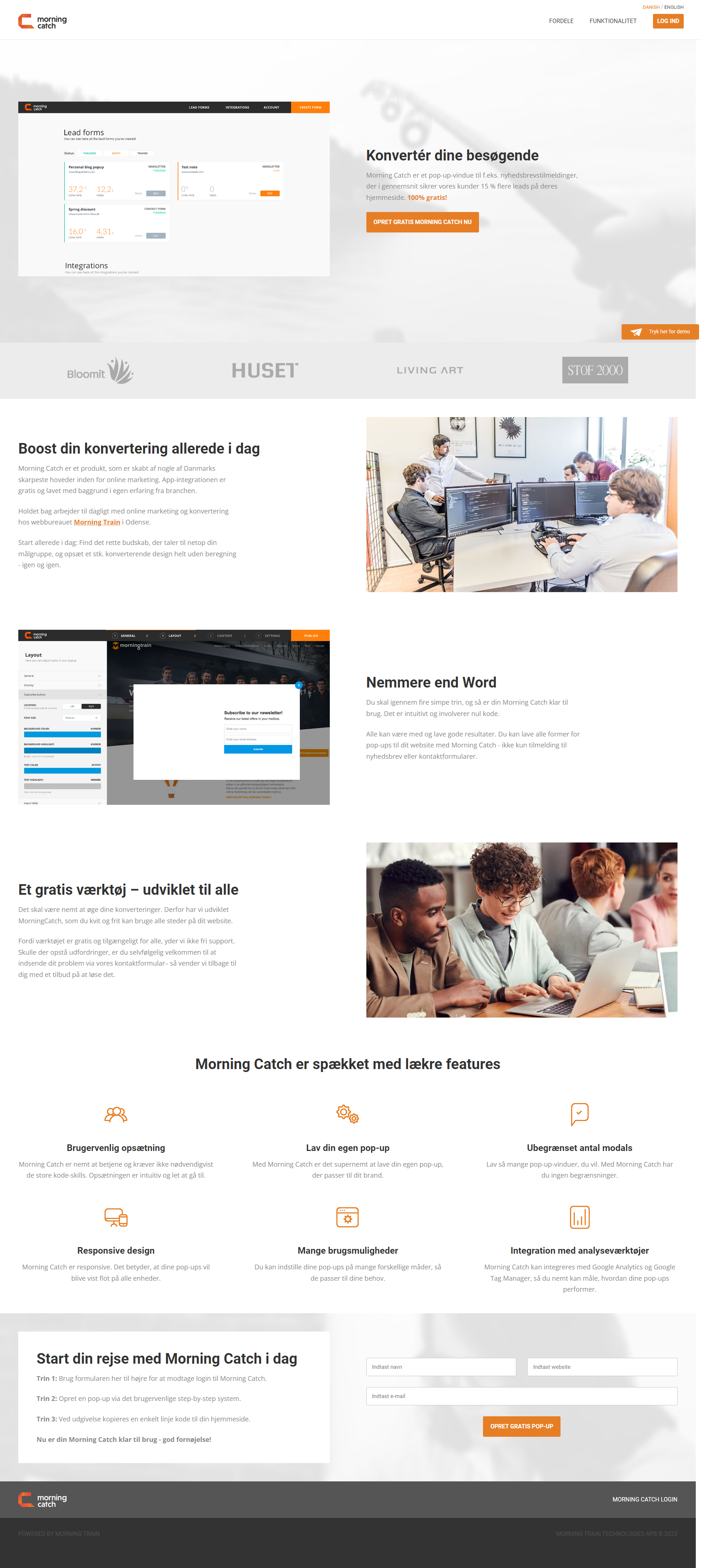
This is the current landingpage for Morningcatch back from 2017.

05
The final design

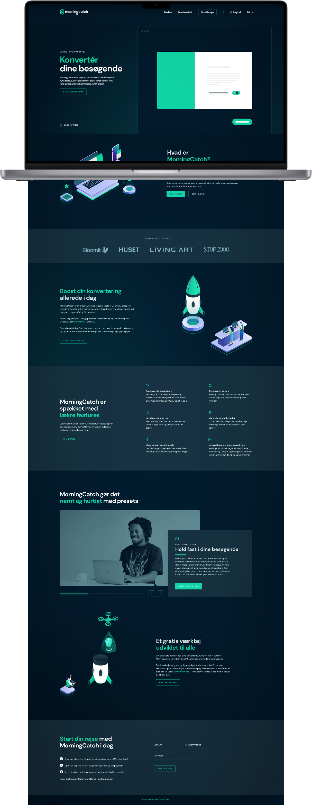
Popups are all about generating leads and boosting conversion rates. Back when I made my color scheme, the thought of giving the site a kind of space theme had hit me, And the thought of building rockets to boost the conversion rate just made sense to me.
To give the website some life I gave some sections a glowing aura in the background.